Eastland
— B2B launch campaign.
— B2B launch campaign.

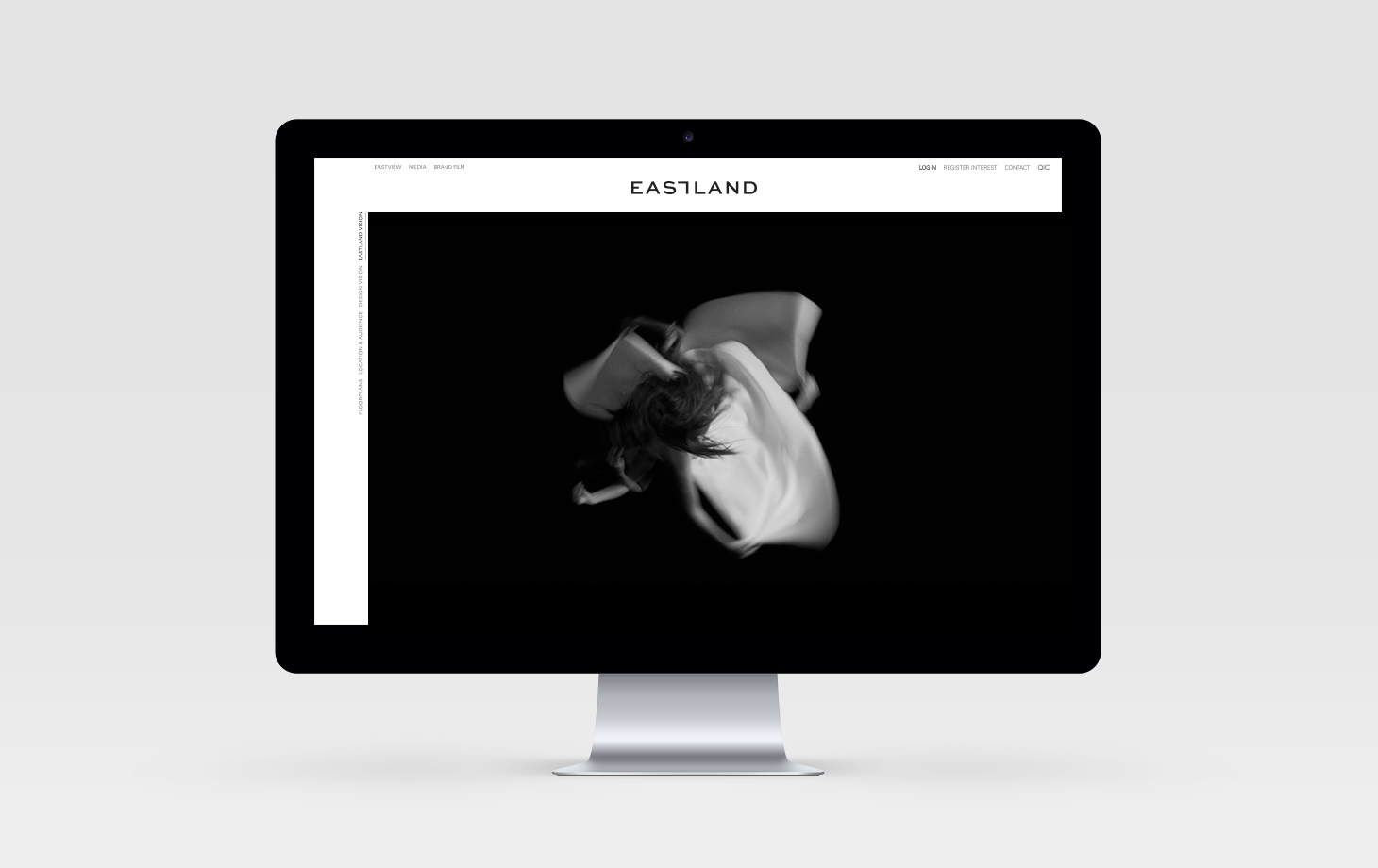
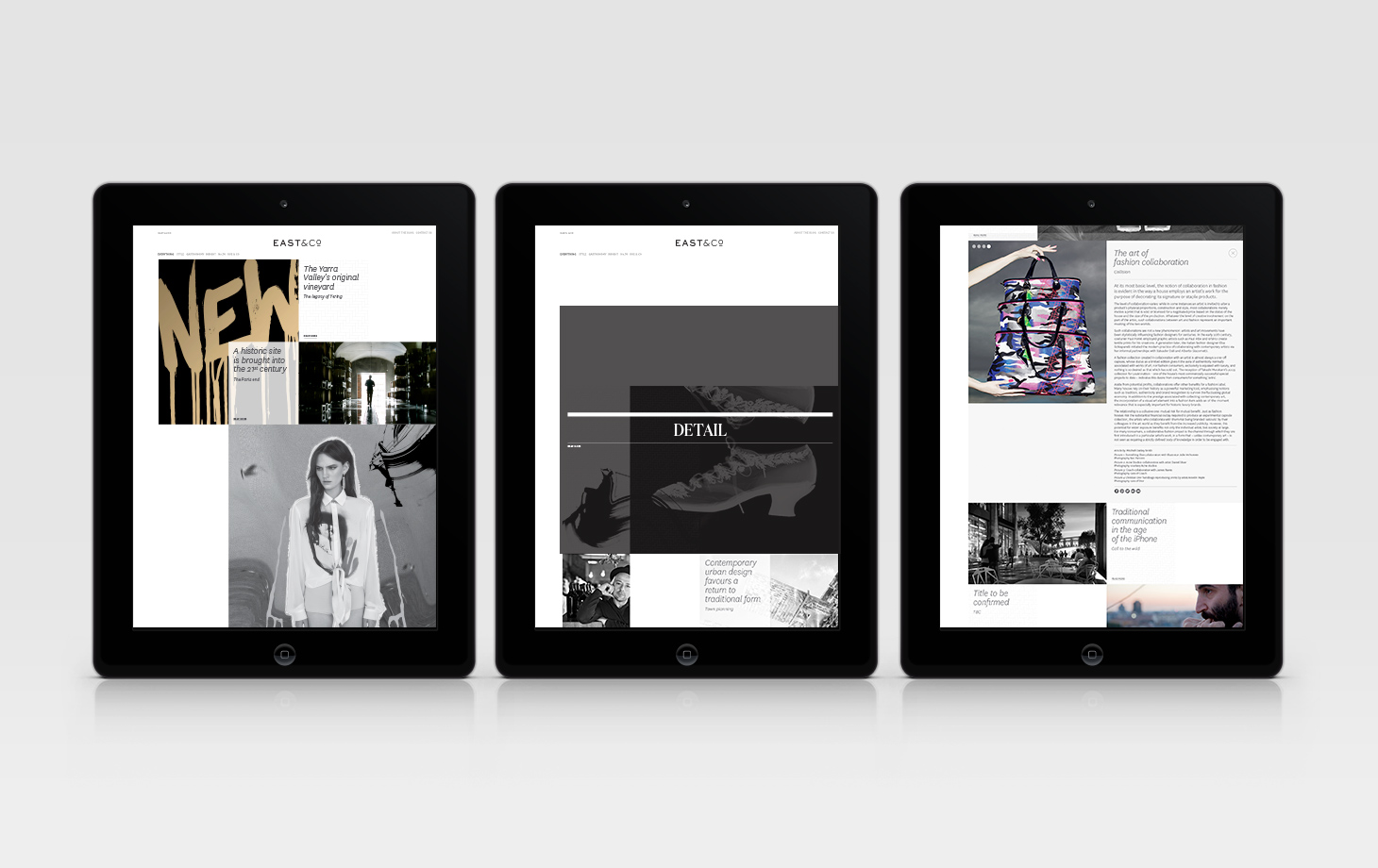
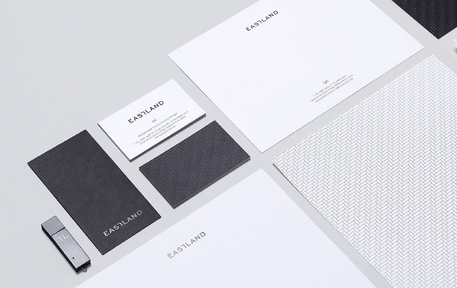
What began as a repositioning brief, turned into a first in market for QIC GRE’s new vision. eskimo was originally approached to reposition Eastland Shopping Centre for a premium offering and market, and to create the logo mark and the B2B collateral.
Positioning Eastland
— as the magnetic heart
of the region.
— as the magnetic heart
of the region.
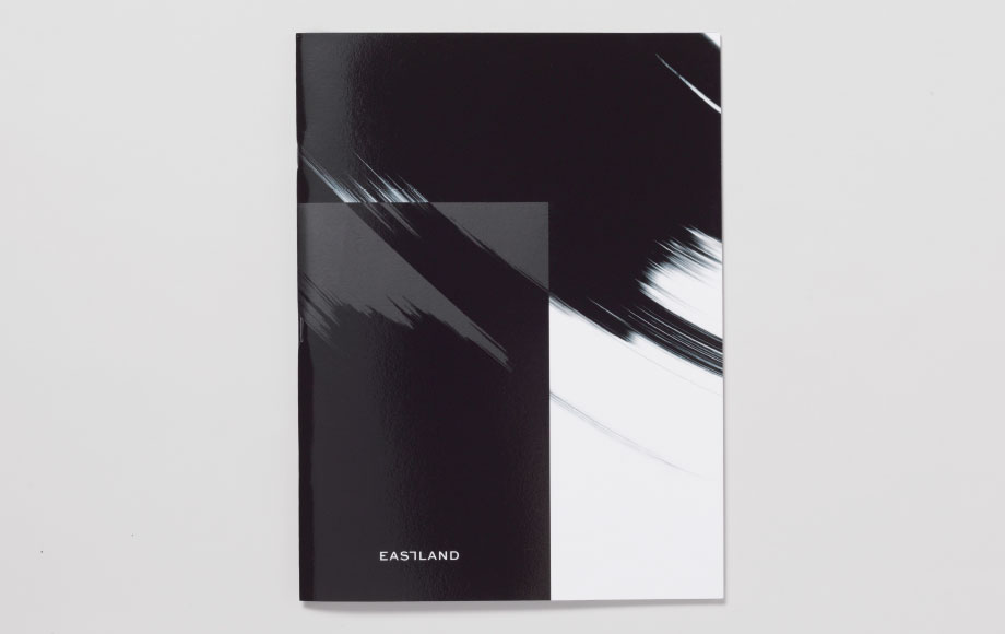


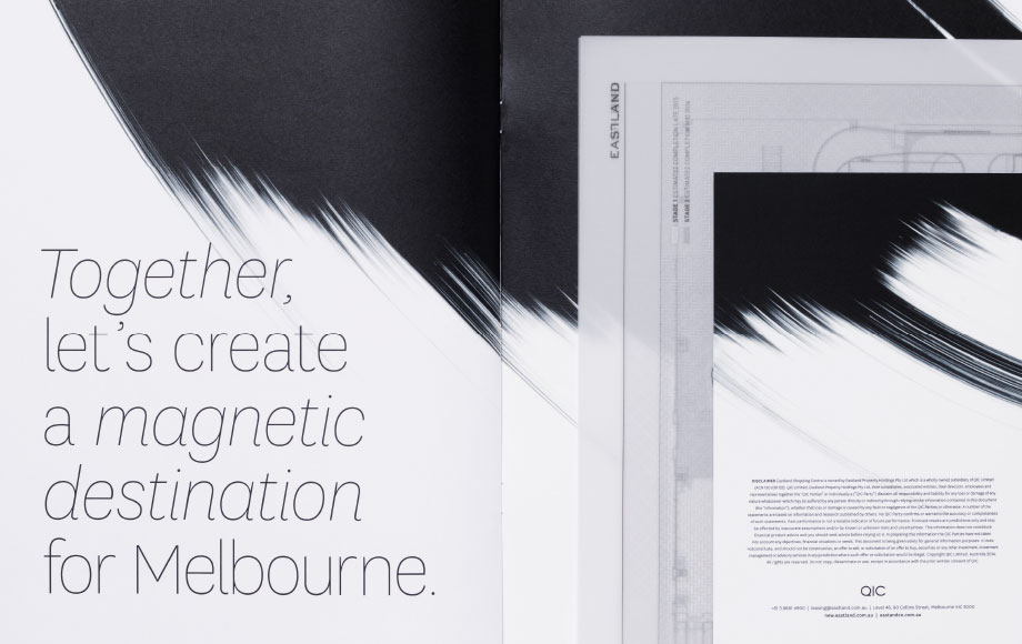
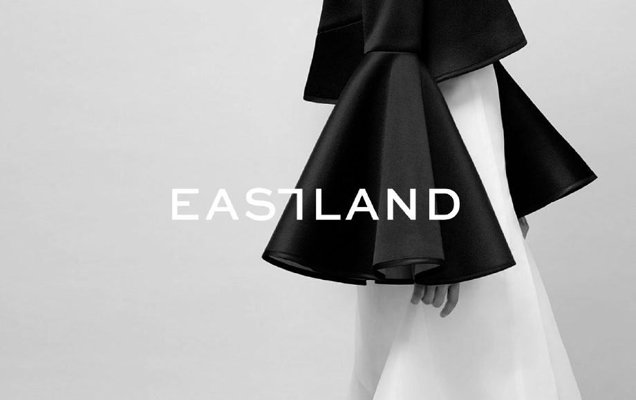
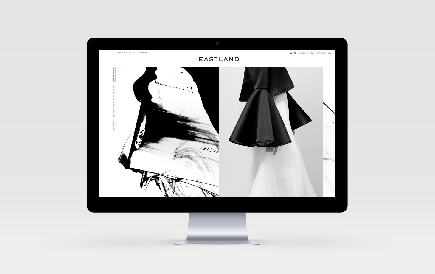
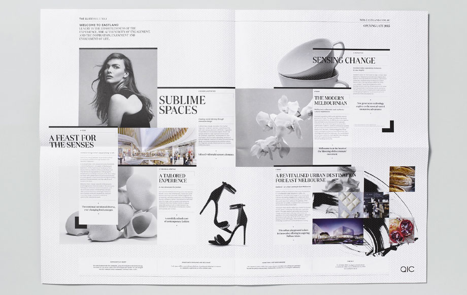
Our response, based off community insights, was the development of a creative platform centred around ‘coming together’, positioning Eastland as the magnetic heart of the region. eskimo devised a graphic language that expressed this idea by first examining the letters ‘T’ and ‘L’ in ‘Eastland’ transforming into framing brackets. From this same graphic we created a signature weave as a representation of being a part of the fabric of the community.
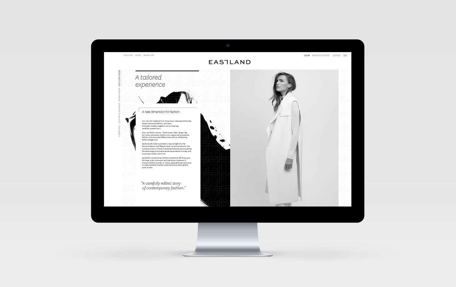
The photographic approach was textural, timeless and tailored – a monochrome suite to elevate Eastland to the premium positioning they were after.


While establishing Eastland’s B2B brand, there was a business-wide decision for QIC GRE to move away from the transaction led business approach of their shopping centres, to putting people at the heart of everything they do; listening to the communities they serve and creating destinations that facilitate meaningful experiences.
A creative platform
— centred around
‘coming together’
— centred around
‘coming together’